Hollywood poster analysis
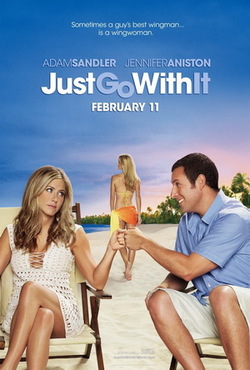
Just Go With It is a rom-com. The two woman in the picture are pretty and made to look desirable, the role of the women seem important from looking at this poster and the subtitle. The woman in the middle is made to look sexy and that happens to be the woman that the man is interested in, whereas the woman sitting down who is more covered up and perhaps slightly older, happens to be his friend. The films target audience is PG-13 and I do not think this is made obvious through the representation of woman as the film is clearly about a desirable woman which would usually be a film for a slightly higher target audience. The gender of the films target audience is more likely to be female as the film is obviously a rom-com, although there could be some male viewers as the film is about a man going after a glamorous woman.
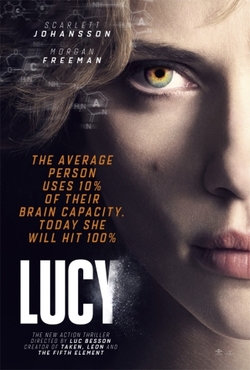
Lucy has 3 genres; action, sci-fi and thriller. The woman in the poster looks strong and powerful as her face is close-up and she's looking straight into the viewers eyes, also the subtitle presents her as a superhuman. You can tell that her role is very significant and the movie is quite obviously about her. The film's target audience is 15 and above which i'd say is made obvious through the representation of the character 'Lucy' because the poster looks quite dark and her face looks so dangerous.
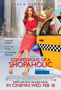
Confessions of a shopaholic is a rom-com. Woman are represented as their stereotypes; shopaholics. The woman in the poster looks like a very stereotypical girly-girl; glamorous, made up, and slightly empty-headed. Her role is clearly significant as she is the only one in the poster. The films target audience is a PG and the gender is prodominantly girls. This is made obvious through the representation of woman as the film looks silly and no too serious, also the colours are very chirpy and bright which would attract a younger audience, especially females s the film is very obviously about shopping and love when you read the sub-title.
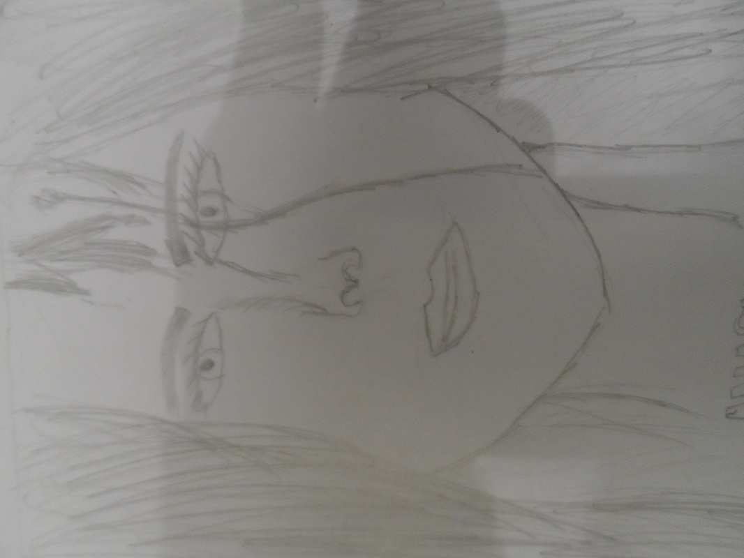
poster draft
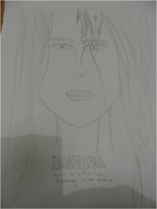
hollywood hybrid poster
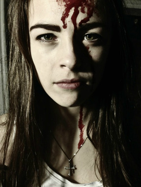
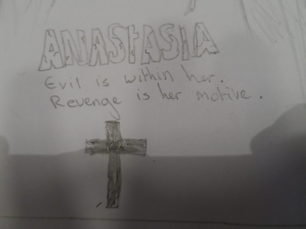
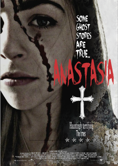
This was the image I was going to use at first. I liked contrast between light and dark, and I also liked the fact that the cross on her necklace were showing. I ended up picking the other image because in this one she doesn't look that serious and I wanted her face to be right up close on the poster.
|
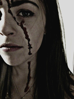
The original image was just like this without the effects. I set a low lighting and made her face pale with makeup and dripped fake blood down her face. I went on an editing site called picmonkey, brightened the picture and contrasted the light to make her hair and shadow darker. I added 3 different effects without trying to totally black out the redness of the blood. I was really happy with the end result because the picture looks dark and of, and her skin almost looks dirty. Also, the blood looks a lot darker than it did before I added the effects. I wanted her face to look straight but with emotion in her eyes that could look hurt and serious. I didn't want to do anything too unrealistic to her face, to keep the film looking as realistic as ghosts can be.
|
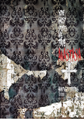
The background wallpaper was an image I found and I liked the way it was dirty and scruffy to add a more disturbing and rougher effect. I downloaded a font called 'face your fears' for my title because other horror fonts looked more childish. I found a cross that fitted in well with the look of the poster that I wanted and to make a link to the religious/exorcism theme related to my character. I used the paint bucket tool to fill some parts in white to make the wallpaper look older and scruffier.
The hybrid genres
The genres I've used for my film is drama/horror/thriller. Most films that are similar to the idea of the film that I have, are also of the same genres. I feel that the poster makes the film look darker and more serious than just a normal horror so a drama or thriller hybrid is evident.
Target audience
The target audience for my film is 15+. I would expect a predominantly female audience as horrors usually attract a female. I made the certificate 15+ because the box office makes a lot of money off of teenagers that love the thrill of a horror. I would not expect a vast amount of males to see my film as it is evident that the film is based around a girl that is evil and that usually attracts more girls.
Representation of woman
The representation I was aiming for woman in my poster was strong, and important. It is evident that 'Anastasia' has a main character, and that the girl in the poster is important to the film. The absence of a male in the poster shows that there is most likely not a love interest, and that there may not be a male lead character.
