|
|
evaluation of film noir and hollywood hybrid posters
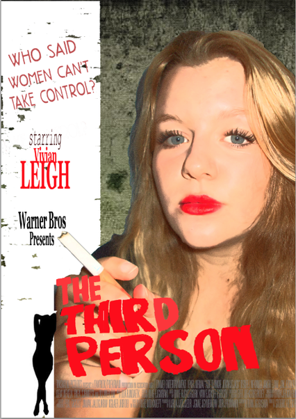
Film Noir poster
Warner Bros would produce this film they have produced many famous Film Noir's such as The Maltese Falcon. The target audience my film is aimed as is male and females 15+. This is because the younger generations should get to know Film Noir, and older people will remember it. My poster is aimed a slightly older audience and will hopefully entice males and females to see the film. This is due to the fact that the woman on the poster is playing a lead role, and she is powerful and strong looking, which may entice a female audience. Also, the woman on my poster is made up and attractive which would grab the attention of a male audience.
I researched many different Film Noir posters for inspiration and found one called 'Pickup' and I loved the layout of the poster but also the careless expression is the woman's face. The idea for my poster was inspired by this. I also researched typical Noir fonts so I'd know which ones to use and which ones to avoid.
A typical Noir convention is the use of the Femme Fatale, a strong and independent woman that represents woman as being powerful. By putting my Femme Fatale on my poster on her own, it shows that she plays a lead and that she does not have a love interest. Usually in films, woman are weak and play the role of a 'Damsel in Distress' but in this poster it clearly shows that she isn't weak.
I had multiple different pictures of my 'model' and in the end I chose the picture on my poster as I loved the way her facial expression was quite simple and plain yet somehow it seems she is smirking, making her seem dominant. I wasn't sure whether to use the silhouette of the woman or not but in the end I did and I feel that it shows the Femme Fatale's seductive personality that she is not showing in her main photo.
A strength in my final poster in my opinion, is the painted effect on the poster as colourful Film noir posters all had to be painted in the 1940's. I also feel the picture is a strength of the poster however the title could have been a lot better. It is slightly messy and out of place and does not suit the picture.
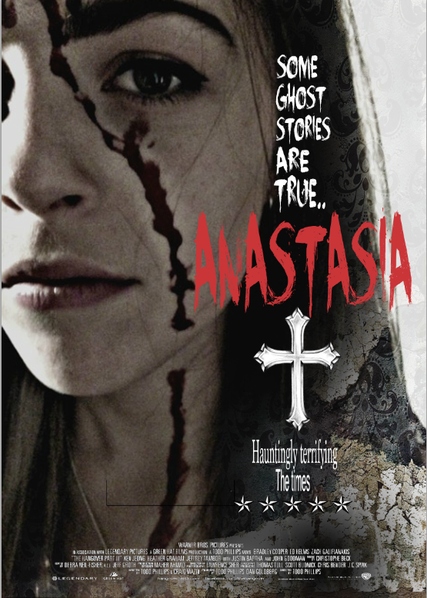
Hollywood Hybrid poster
Warner Bros would definitely produce a horror like Anastasia as they have produced many similar horrors such as 'Orphan', 'Annabelle', and 'The Conjuring'. The film and poster is aimed at a 15+ audience which is obvious in the poster as it does not look suitable for a younger audience. Horrors attract a predominantly female audience and my poster is aimed more at a female audience due to the lead character being female but also looking scary and powerful instead of seductive and attractive which would attract more of a male audience.
I looked at many posters of horror films to imagine what I wanted my film to be about and then to decide what type of role the woman on my poster was going to take e.g evil or good. I saw the poster of the film 'Carrie' and this inspired the idea for my poster. This is also where I got the idea of trickling blood down my 'model's' face. The poster also inspired the idea for my poster to show that the film is to do with evil possession and religion.
Conventions of an evil character in the poster include the character being dirty, and dominant as the audience is meant to be scared. I used this in my poster and made it clear through facial expression that the character is not scared and therefore she is powerful. This represents women far better than if I used an image of a woman crying and screaming on my poster, making women look like a weak target.
I wasn't sure whether to put my model in the first and take a mid-shot, or to take a picture of her up close. I decided to do a half face close-up as it is easier to see careless yet strong emotion in her eye, and the blood is shown as more of an important feature to the poster.
A weakness in my poster is the lack of clever design, for example doing something clever with the title to give the audience an insight on what the film may be about. However, I do feel that the layout of the poster is neat and I love the fade effect which links to the word 'ghost' in the subtitle, suggesting that the woman on the poster is some sort of spirit.
Warner Bros would produce this film they have produced many famous Film Noir's such as The Maltese Falcon. The target audience my film is aimed as is male and females 15+. This is because the younger generations should get to know Film Noir, and older people will remember it. My poster is aimed a slightly older audience and will hopefully entice males and females to see the film. This is due to the fact that the woman on the poster is playing a lead role, and she is powerful and strong looking, which may entice a female audience. Also, the woman on my poster is made up and attractive which would grab the attention of a male audience.
I researched many different Film Noir posters for inspiration and found one called 'Pickup' and I loved the layout of the poster but also the careless expression is the woman's face. The idea for my poster was inspired by this. I also researched typical Noir fonts so I'd know which ones to use and which ones to avoid.
A typical Noir convention is the use of the Femme Fatale, a strong and independent woman that represents woman as being powerful. By putting my Femme Fatale on my poster on her own, it shows that she plays a lead and that she does not have a love interest. Usually in films, woman are weak and play the role of a 'Damsel in Distress' but in this poster it clearly shows that she isn't weak.
I had multiple different pictures of my 'model' and in the end I chose the picture on my poster as I loved the way her facial expression was quite simple and plain yet somehow it seems she is smirking, making her seem dominant. I wasn't sure whether to use the silhouette of the woman or not but in the end I did and I feel that it shows the Femme Fatale's seductive personality that she is not showing in her main photo.
A strength in my final poster in my opinion, is the painted effect on the poster as colourful Film noir posters all had to be painted in the 1940's. I also feel the picture is a strength of the poster however the title could have been a lot better. It is slightly messy and out of place and does not suit the picture.
Hollywood Hybrid poster
Warner Bros would definitely produce a horror like Anastasia as they have produced many similar horrors such as 'Orphan', 'Annabelle', and 'The Conjuring'. The film and poster is aimed at a 15+ audience which is obvious in the poster as it does not look suitable for a younger audience. Horrors attract a predominantly female audience and my poster is aimed more at a female audience due to the lead character being female but also looking scary and powerful instead of seductive and attractive which would attract more of a male audience.
I looked at many posters of horror films to imagine what I wanted my film to be about and then to decide what type of role the woman on my poster was going to take e.g evil or good. I saw the poster of the film 'Carrie' and this inspired the idea for my poster. This is also where I got the idea of trickling blood down my 'model's' face. The poster also inspired the idea for my poster to show that the film is to do with evil possession and religion.
Conventions of an evil character in the poster include the character being dirty, and dominant as the audience is meant to be scared. I used this in my poster and made it clear through facial expression that the character is not scared and therefore she is powerful. This represents women far better than if I used an image of a woman crying and screaming on my poster, making women look like a weak target.
I wasn't sure whether to put my model in the first and take a mid-shot, or to take a picture of her up close. I decided to do a half face close-up as it is easier to see careless yet strong emotion in her eye, and the blood is shown as more of an important feature to the poster.
A weakness in my poster is the lack of clever design, for example doing something clever with the title to give the audience an insight on what the film may be about. However, I do feel that the layout of the poster is neat and I love the fade effect which links to the word 'ghost' in the subtitle, suggesting that the woman on the poster is some sort of spirit.
